Lexie Langella

Data-driven professional who loves solving problems. Cat mom.
View My LinkedIn Profile

Points, Assists, Rebounds, Oh My!
Introduction
Let’s just say, I am not a sports fan.
The closest I’ve gotten to sports was playing in marching bands at football games and playing in basketball pep bands. So I had to brush up on my sports terminology. In order to practice more Tableau skills, I was assigned a sports project, specifically about basketball.
What I learned from this project was:
- Center position is the most effective at making 3 pointers.
- The more assists, the more points scored. Center has made more rebounds.
- How to show the total points of each team and each player.
- Point guard has the highest number of assists.
The Data
The data from this project comes from a website called “Basketball Reference.” On there, they have NBA player stats. The data I used comes from 2022. This data set contains 812 rows and 31 columns, where each row represents a player and the columns contain information like position, team name, player name, and stats like 3 point percentage. I used Tableau to create visualizations using this data.
Analysis
I answered 4 questions related to professional basketball:
- What position is the most efficient at shooting 3-pointers for every team?
- How did different players/positions do on total points, total assists, & total rebounds?
- Show the total points scored by each team and how much each player on that team scored.
- Which players had the most assists in every position?
Question 1
The first question asks: “What position is the most efficient at shooting 3-pointers for every team?” I showed this by creating a heat map.
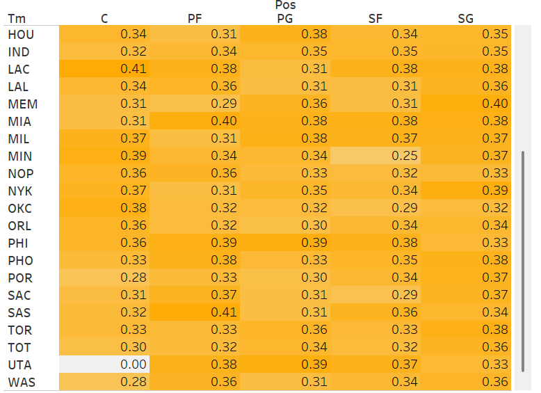
This heat map shows the average percentage of 3 pointers for each team and each player’s position on that team. The darker the color, the higher the percentage. I couldn’t show all of the data here but I concluded that Center position has higher percentages with an outlier of “0” for UTA.
Question 2
“How did different players/positions do on total points, total assists, & total rebounds?” I answered this by creating a bubble plot to show the three different criteria:
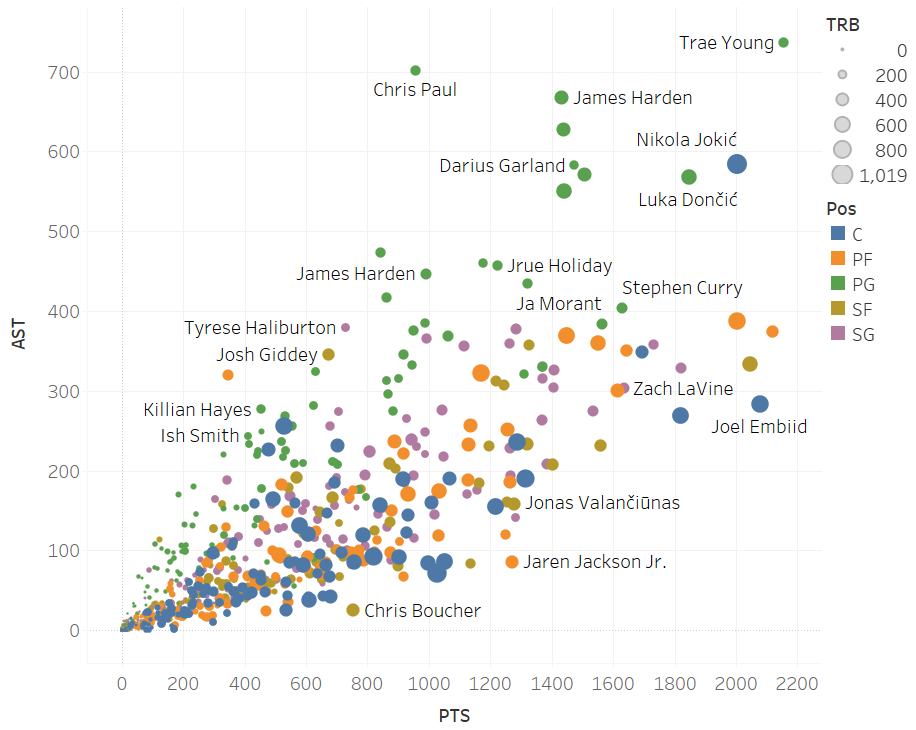
Total Assists is on the y axis, Total Points is on the x axis, and Total Rebounds are indicated by the size of the “bubble” for each plot point. Also, here is what the colors represent: Blue represents Center position, orange is Power Forward, green is Point Guard, brown is Small Forward, and purple is Shooting Guard.
This bubble plot indicates that the more assists made, the more points scored. There are more green dots that have higher assists since those represent Point Guard and assisting/passing the ball is part of their job. There are more larger blue dots which means Center position made the most rebounds. Outliers include players Nikola Jokic, Chris Paul, and Trae Young. Chris Paul and Trae Young are both Point Guards with over 700 assists and 958 and 2,155 points scored, respectivly. Nikola Jokic is a Center that has 1,019 total rebounds, 584 assists, and 2,004 total points scored. These players are valuable and ones to watch.
Question 3
Question three wanted me to show the total points scored by each team and how much each player on that team scored. I answered this by using a stacked bar chart:
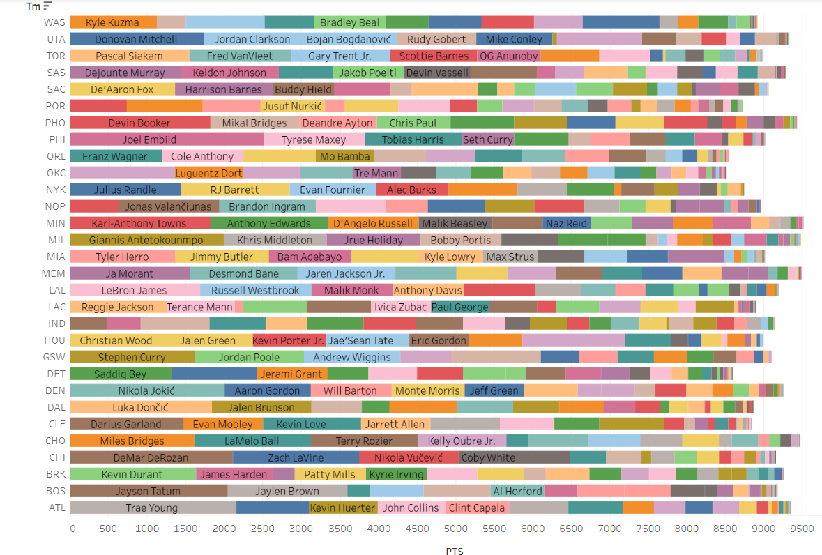
In this chart you can see each team name on the y axis representing each bar as a whole and the different colored segments of each bar represent a player and how much they have scored in that season. The top 5 teams who scored the most that season are the Minnesota Timberwolves or “MIN”, the Memphis Grizzlies or “MEM”, the Milwaukee Bucks or “MIL”, the Charlotte Hornets or “CHO”, and the Phoenix Suns or “PHO”. The highest scoring player on those teams are Karl-Anthony Towns from MIN, Ja Morant from MEM, Giannis Antetokounmpo from MIL, Miles Bridges from CHO, and Devin Booker from PHO. In my Tableau Public profile, you can hover over each segment and see how many points each player scored.
Question 4
The last question asks, “Which players had the most assists in every position?” I used a treemap to answer this question:
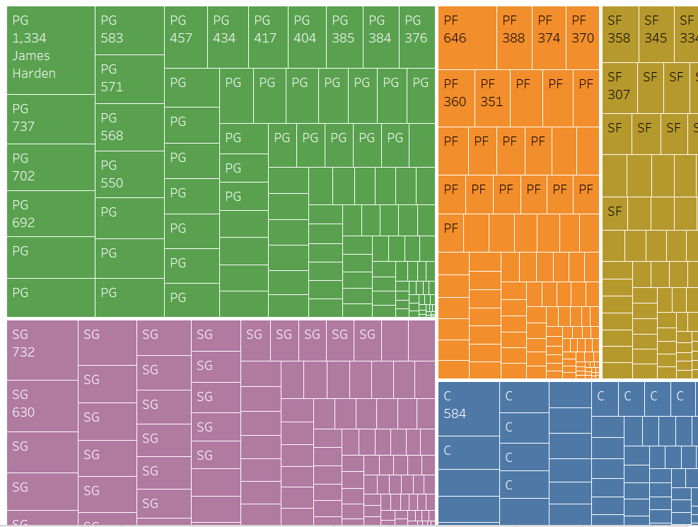
Each color represents a position on the team with the same colors used as the bubble plot. With the positions clearly divided by color and rectangles and assists labeled for each player, you can see that Point Guard had the most number of assists that season.
Conclusion
Am I a sports fan now? Nah.
Did I learn a little more about basketball? Yes.
And I appreciated the opportunity to learn more Tableau skills. You can view my Tableau story on my Tableau Public profile to interact will all of the visualizations I included in this data story. If you would like to connect, please reach out to me on LinkedIn!